A Brief History of Web Maps

Or how a Flemish cartographer and PNGs made web maps a part of our everyday lives
Originally published on Towards Data Science in May 2020
When was the last time you were lost? Really think about it.
Unless you didn’t have a phone or yours ran out of power, you likely had directions telling you where to go, or you ended up watching a blue dot to tell you exactly where you are.
That concept, knowing your exact location at any given time, was a far off idea only 15 years ago. Yet in the years since, the world of mapping, location, and how we interact with the world around us was changed to the point where you likely won’t feel lost ever again.
Anyone who has been on a news organization’s website has likely seen a map showing how the coronavirus pandemic is changing daily. Visualizing geospatial data online wasn’t always an easy task, and this period also brought about major changes in how we interact with geospatial data online.
Location and how we interact with it has become ubiquitous in our lives. The story of how we got here involves a long list of individuals, companies, and ideas that ended up shaping how we interact with our world. No one version of this story can possibly tell every single part, but I hope it helps to give you a sense of how we got here.
A brief background in cartography
This period in history ties into the long history of map-making. Cartography is part science and part art. It is about presenting the world as it is, while also making great compromise: for every choice to include something, there is something you have to exclude.
This applies to what is actually on the map (it would be impossible to represent every feature on the earth on one map) as well as to the projection of the map, or how the 3D globe is projected to a 2D surface.
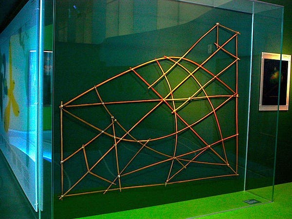
Cartographers throughout have understood this concept and their maps tell a single story with one purpose in mind. Polynesian and Micronesian voyagers created detailed stick charts that allowed them to map connections between islands and understand swell patterns. Portuguese explorers created detailed maps of coastlines with nearly empty interiors as they were solely focused on discovery and sailing.
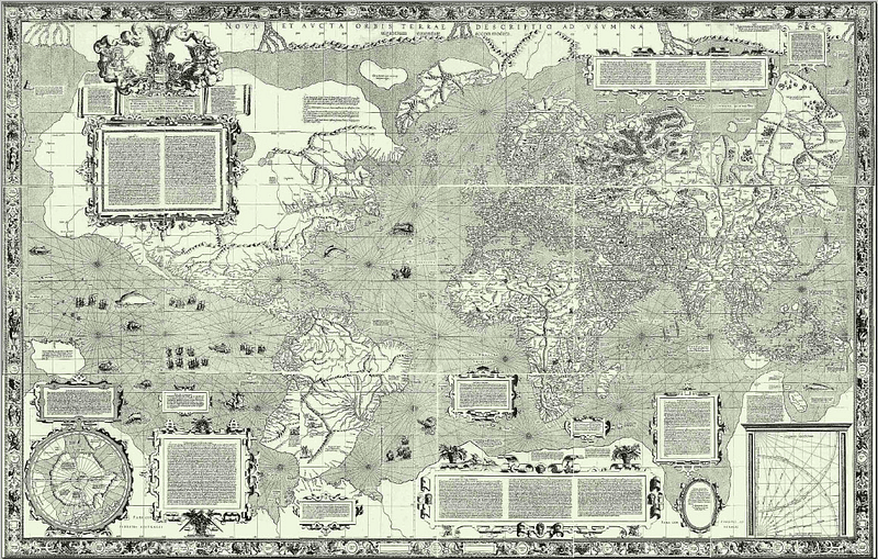
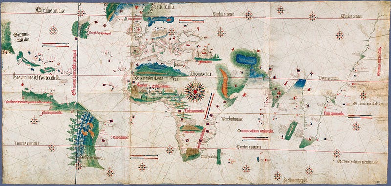
And in 1569, a Flemish cartographer named Gerardus Mercator released a map with a new projection that served one single purpose: to aid sailors with the ability to find any course on the map with one straight line.
This projection created hundreds of years ago plays a major role in the way we interact with maps online. Almost every single map we view online uses the Mercator projection or slight variations of it.
However web map providers don’t use it for its ability to find straight-line paths between two points, but rather because you can project the entire globe on an almost square image. We will get to the importance of this later on.
Join other geospatial professionals in my once a month newsletter
[mailerlite_form form_id=2]
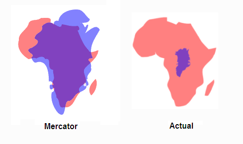
Of course, for what was gained from the Mercator projection, map engineers gave up something as well — in this case, the distortion of objects as you move away from the equator.
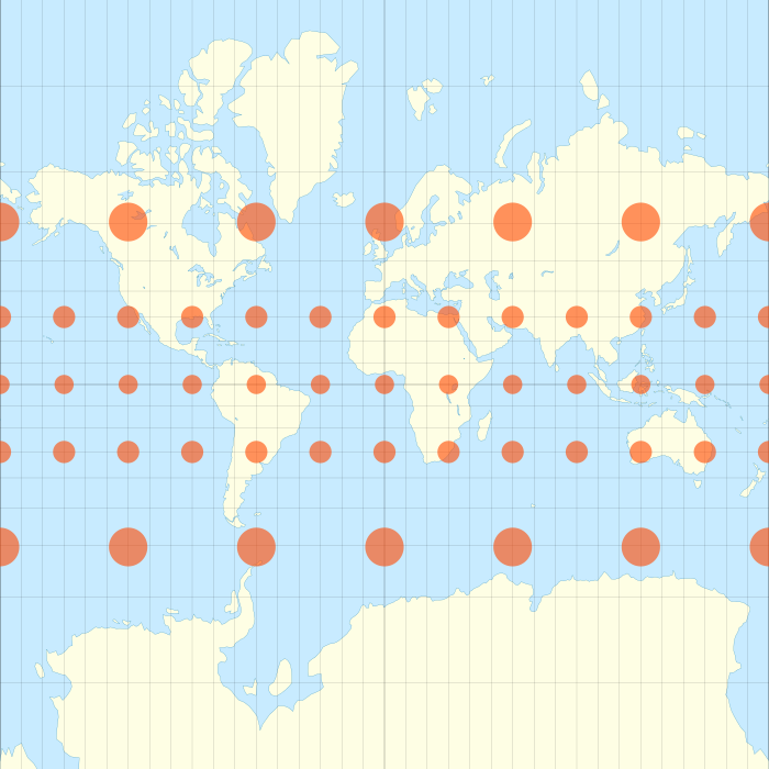
This isn’t something you would notice at a large scale (or local level) such as on your street, or even in your city or state. But at a small scale (global view) this makes Greenland seem similar in size to the entire continent of Africa, which in reality Africa is nearly 14 times larger than Greenland
There are two key points to note before we jump into the detailed history of maps online. First, is that web-mapping conventions are, from their genesis, at odds with the conventions of cartographic design and science. Ask anyone who has had some GIS training and they will likely tell you that Mercator would not be their first choice for displaying global map data.
The second consequence is the distortion of the globe in most web maps. As web cartography has become the default for the way we interact with the world, billions of people will have their understanding of the world fundamentally distorted. This clip from the West Wing explains it quite well and is known by almost everyone who works in geography or cartography.https://forrest.nyc/media/cb4df6798f85ee07fed0dae47f964770
The first maps on the web
It isn’t clear what the first online map was. It may well have been a static image of a map of some location we will never know. What separates a static map that lives web compared to a true web map is interactivity. The fact that a user can engage with and choose what the see on the map makes web mapping a unique category. For the first time in history, the viewer of the map has the control to decide what they see, not just the cartographer.
What many agree on is that one of the first web maps, the PARC Map Viewer, was launched by Xerox in 1993. The features were simple, you could view the map, zoom in and out, turn layers on and off, and more. Even in this early application, we can some of the fundamentals of web maps today.
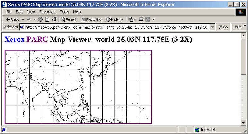
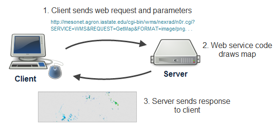
To show data on the map, the PARC Map Viewer would read a request from the user, and using a geographic database it would render a map image, then return the map image from the server back to the browser.
This loop — user request, rendering of data, return to the user — still makes up the core of most web maps. Even the PARC Map Viewer URL (see above) which includes parameters for latitude and longitude is still in Google Maps today.

The PARC Map Viewer was also used for another fundamental element of web mapping: showing other data on top of a map. In this case, it was data displaying earthquakes around the globe. The World-Wide Earthquake Locatorwas developed by the Univerity of Edinburgh in 1994, the project page is still online and provides a description of how the map worked:
The original system used data available from the National Earthquake Information Center (NEIC), part of the U.S. Geological Survey (USGS). This data provides basic information about earthquakes within hours of them taking place. In reponse to a query, the data was dynamically accessed from a USGS server in Golden, Colorado. The data was then processed into an appropriate format in Edinburgh and finally displayed using the Xerox PARC Map Viewer based in Palo Alto, California again in the USA. Read the complete justification for the original Earthquake Locator.
This was known as a mash-up and shortly after the launch of Google Maps, we will see how one developer took this same concept and started a chain of events that created a new industry. For web mapping to truly take off, it would take two companies with the same vision: allowing users to lookup an address and showing them a map of that address.
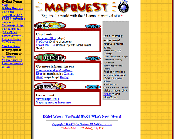
In 1996, Mapquest was launched. Shortly after in the same year, Multimap was launched in the UK. These were the first consumer-facing web mapping services and from this point forward, the way that everyone in the world interacts with location starts to change.
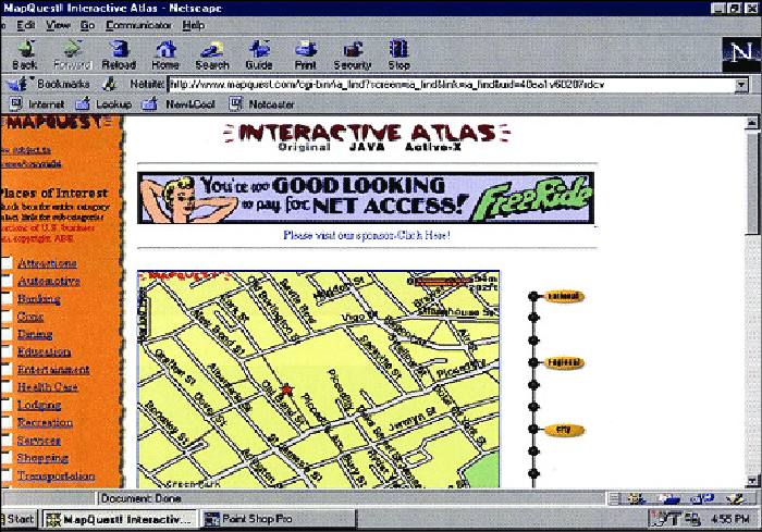
The early novelty of typing in your address and seeing a red star pop up on the map where their home is was so unique, that these services quickly became some of the most popular sites online. Mapquest eventually became a publicly-traded company and was ultimately acquired by AOL for $1.1 billion in 1999.
Of course, it wasn’t just the novelty of finding your home on the map, but the ability to get driving directions between two locations. The slow decline of printed road maps had begun and it was clear that there was a large market available for consumer-based online maps.
Mapquest itself added a few basic elements into the web maps we know today. The zoom bar was a new addition to the web map, as well as the ability to pan the map location.
For the user, the major downside of panning and zooming the map was that every time the map moved, the complete map view would reload. So while the map was interactive, it was ultimately quite slow.
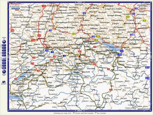
Most web maps would use this basic structure for the foreseeable future. This period saw several other map providers start: traditional GIS providers also launched their web services (MapInfo and ESRI), a man named Steve Coast started a project called OpenStreetMap in 2004, while Yahoo and Microsoft also started to explore mapping.
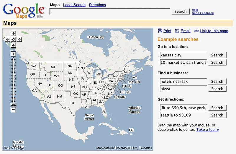
All this time Google was making several key acquisitions that would eventually make up the base of what would become Google Maps. And then on February 8, 2005, everything changed.
Google Maps and map tiles
Google Maps wasn’t the first attempt at location-based search. The company launched a feature called ‘Google Local’ in 2003 where users could include a location with your search. If you wanted to find coffee shops near Chicago, IL, you would just enter your location and your search term.
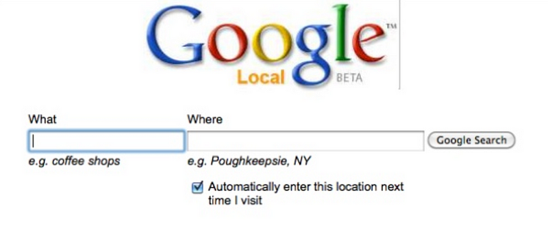
The feature wasn’t very popular at the end of the day. Recode interviewed several team members from the earliest days of Google Maps in 2015, and Bret Taylor, the product manager for ‘Local’ shared his insights on the project:
“It was a practically useless project,” says Taylor.
The grand example for Search by Location was you were supposed to be able to search for coffee shops near Palo Alto. But Taylor remembers that Sun Microsystems put its address at the bottom of every page of its website, and it named its products after coffee (most famously, Java). So that broke the entire example.
“It had zero users per day,” says Taylor, who is now CEO of productivity startup Quip, after a stint as CTO of Facebook.
But Google wasn’t done trying to bring location into their search products, and in 2004 the company started the process of acquiring Keyhole, Where2 Technologies, and Zipdash. These three technologies would form what we would know as Google Earth, Google Maps, and Google Maps Mobile respectively.
Chris Sacca, now well known for his various investments, was on the investment team that lead the acquisition of Keyhole and shared this from the same Recode article:
I’ll never forget, we were in a meeting discussing the acquisition of Picasa, and this young guy Adrian Graham, who sort of looks like Morrissey, was going through the slides and pitching how we integrate Picasa, and [Google co-founder] Sergey [Brin] was totally distracted. And this was in building 42, in a conference room that had a stairclimber in it, because Sergey wanted to use his time better in meetings.
He’d shown his laptop to a couple people, and people said, ‘Oh shit, do me, do me.’ And this guy doing the presentation was really starting to sweat, and Sergey eventually gets up and unplugs the projector, says ‘This thing’s cool and we should buy it,’ and he plugs his laptop into the projector and shows us Keyhole. And, literally, these executives are shouting out their addresses because they want to zoom in on their houses from space.
The same thrill that users got from seeing a red star on a Mapquest Map, the Google team, and millions of users after Google Earth launched, got from zooming in on their house from space.
Zipdash would become the first version of Google Map Mobile, which Google acquired in 2004. The app allowed users to see traffic delays on their phones and also allowed users to leverage the GPS position of their phone to get information pertinent to their actual location.
Where2 was foundational to the Google Maps that we experience on our laptops and computers, and in fact, all web maps today. Their vision put maps at the center of the experience of navigation, whereas Mapquest relied on a list of printed directions and street sign icons.
The Australian company was almost acquired by Sequoia Capital, who ended up dropping the deal but ultimately introduced the team to Larry Page. However, the technology Where2 had built was a desktop application. Stephen Hutcheon describes how the team quickly turned it into a web application:
But Larry Page and Google were not interested in application software. “We like the web,” he is said to have told Lars Rasmussen, one of the Gordon’s fellow co-founders. And he set the team a deadline to get their idea working in a web browser.
The team delivered and in August, 2004 a deal for an undisclosed sum was inked, making Where 2 Google’s second-ever acquisition.
The team used the same fundamental loop of passing a request from the browser, to the server to return the map data, and then loading it in the browser. The major difference was how they used AJAX, a fundamental tool in the Web 2.0 transformation that allowed for this loop to happen in the background without interrupting the user’s experience.
Once the three companies had officially joined Google, they got to work building Google Maps. What they were building would eventually become the standard for every web map from this point forward, and would allow the user to pan, zoom, and move the map with their mouse — the slippy map.
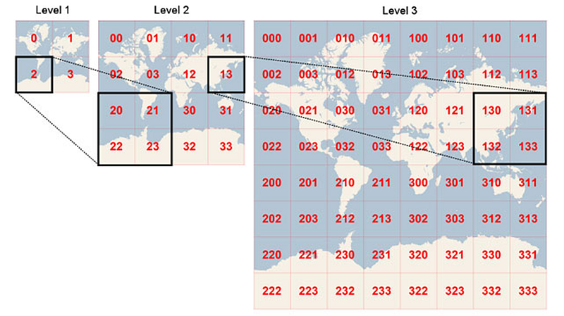
Technically known as a tiled web map, the key lets the map work in this way is the fact that the map image is not one single image, but many tiles, stitched together. This matters for a few reasons.
First, is that the tiles themselves are quite small. The size that they came up with, 256px by 256 px which became the default for web maps, might be only a few kilobytes. Each one could load quite quickly, and the tile would display when it was returned from the server.
Instead of making a full round trip for a complete map each time as Mapquest and the PARC Map Viewer had, the map tiles would make 10 to 20 very short trips. The maps were also intelligent enough to load tiles that were just outside the map view, so as you started to pan the map, those tiles would be available to you.

Each zoom level has its own set of tiles, so as you zoom in, there would be another tile layer loaded for that zoom. The entire globe will fit on a single tile at zoom level 0, then it will split into 4 tiles at zoom 1, 16 tiles at zoom 2, so on and so on. This presentation by Alan McConchie explains exactly how tiles work in great detail.
Out of all the map projections that have been developed, there was one that was highly suitable for putting the entire map on a single square PNG tile — the Mercator projection. The map projection designed for nautical navigation was now going to be pushed to billions of computers and phones simply because of the efficiency it provided for creating small square PNG tiles.
The second efficiency gain was in the caching of the tiles. While previous map services had to render their map every single time, once a tile was generated, Google simply put it in storage and if it was requested again, it would just use the cached version. This means faster maps. Third, if a tile were to fail, just that tile would not show on the map, and the entire map would not be compromised.
When Google Maps launched in 2005, it was slow to gain traction, but eventually, as they added satellite imagery, it became more and more popular as people started to find the same enjoyment the room of Google executives found in finding their house from the map. The first launch will always be remembered as the “island map” since the only landmass on the map as North America, surrounded by water on all sides.
Many others followed suit: Yahoo, Bing, Teleatlas (now TomTom), Navteq (now HERE — formerly part of Nokia), Yandex, and Baidu. ESRI kept up as well, but all of them used the same base and innovations of Google Maps.
Google ultimately won the battle for consumer-facing online maps. So much so that when Apple needed a mapping provider for their new iPhone launch, the formed a highly secretive and uncomfortable allegiance that lasted five years, starting in 2007.
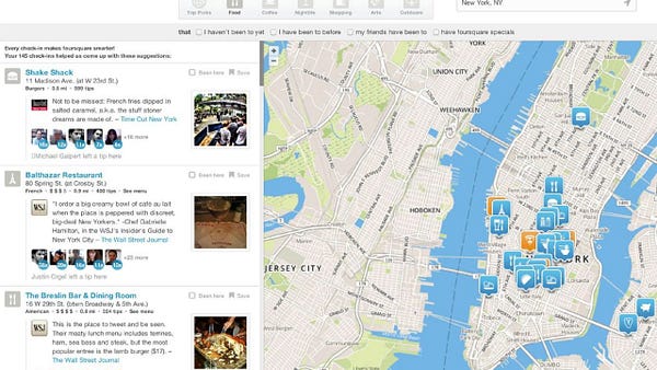
When Google added a little blue dot showing you your exact location, it opened up an entire industry based on your location. Companies such as Foursquare and Yelp, and data providers collecting location data from advertising tools embedded in other apps would start to pop up and continue to change how we interact with the world around us.
Most of the innovations up to this point involved the map itself — the roads, water, and everything else you see. But one curious developer asked the question “can I put my own data on the map”, while many others asked, “what if I want to use the data I see on the map”. These two questions would drive the next phase of innovation in web mapping.
Mashups and OpenStreetMap
Up until this point, most web maps had been focused on the underlying map: the roads, highways, parks, water features, etc. Yet even in the first web maps, it was clear that there was a need for showing other data on top of the maps.
The mash-up map, or using data you have and putting it on top of a web map service, such as Google, was cracked open by Paul Rademacher who effectively found a way to use unsanctioned APIs in Google Maps to display Craigslist for rent listings on top of a Google Map.
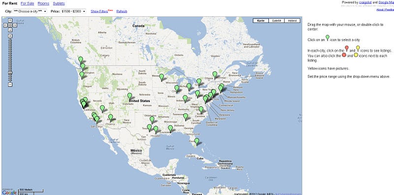
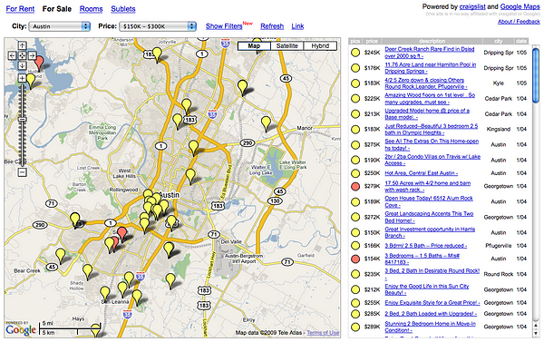
The result was housingmaps.com (now a living relic), which allowed you to view a housing listing on the map, filter results, and click to open the listing in Craigslist. This sort of functionality is something we take for granted today, but this was the first map of it’s kind.
Rademacher had effectively hacked Google Maps to make his own product on top of the freely offered Google Maps. While Google could have taken the route of shutting down the site and restricting access to these APIs, they saw an opportunity.
They eventually hired Rademacher, who now works at Apple according to his LinkedIn, and created the Google Maps API. This allowed any developer to use Google Maps as a service and commercialized the mapping product.
The service has evolved greatly since to include many other tools and products and has been a financial success. In disclosure forms for Uber’s IPO, the company paid Google $58 million between January 2016 to December 2018.
Overall visualization of geographic data online was still quite immature in the late 2000s. For one, data was still difficult to access unless you had a working knowledge of where to find and how to use GIS data.
Many map visualizations for the web were built in Flash and were completely customized and still curated by the cartographer/developer. D3.js opened many options for displaying map data online, but for the novice user, this library was still difficult to master.
While Google opened up many different avenues for users to put their data on the maps, the data within the map remained solely in the hands of Google.
There is no single reason why the mapping space started to grow the way it did in the early 2010s. It partially has to do with users wanting to create base maps with their own custom styles, something Google had limited flexibility on.
Some of it had to do with data access. Google Maps would allow you to contribute edits, but you couldn’t access that data later for yourself. Some of it was born of need. Using maps in humanitarian crises or in under mapped areas was a growing need in the international aid community, or showing more data on the map than Google could allow, such as deforestation data.
Whatever the reason was there were a growing number of companies and projects that began or gained popularity at this time. OpenStreetMap, which began in 2004, slowly gained traction with more contributors and more data added to the map.
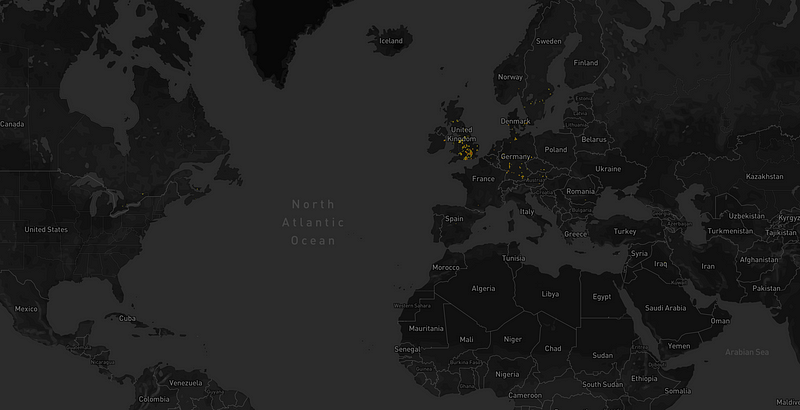

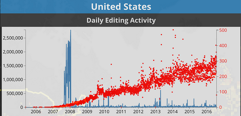
OpenStreetMap (OSM) more or less functions as Wikipedia for maps, allowing any registered user to add or edit features on the map: roads, waterways, points of interest, etc. Communities around the world were slowly adding more data to the map (you can see a visualization of contributions over time here and a more detailed events timeline on the OSM wiki).
As the data on the map became a viable source, other companies were starting, many of them in the open-source community. Mapboxwas founded in 2010 to enable custom mapping using OpenStreetMap data for non-profits with a grant from Development Seed. CartoDB, (now CARTO) was founded in 2011 out of a project to visualize massive amounts of deforestation data. And Leaflet.js was released the same year, allowing users to develop web maps with Javascript with any base map and data.
Communities of users interested in maps were expanding around the world. Maptime meetups, Free and Open Source Software for Geospatial (FOSS4G) and State of the Map conferences, and many different MeetUps were growing and expanding.
What all these trends had in common was the fact that they were exploring web-mapping technology with the same technical base as Google Maps, but using open tools and technology.
Two major events took place that would change the way data would be visualized online: the 2010 Haitian Earthquake and a change in Google Maps API.
When the earthquake in Haiti took place in 2010, there was no viable online map of affected areas in the country. Google Maps barely had any data, and relief efforts on the ground were left without any maps to navigate Port-au-Prince to provide aid.https://forrest.nyc/media/8976a9d83ba5466e82b72817b74e06b2
What happened was something that would dramatically change the path for OSM. Users from around the world began adding data to the map in the days after the earthquake, and within days, OSM became the map used by relief efforts in the country. This blog from the World Bank recalls the response in detail:
Over 450 OpenStreetMap volunteers from an estimated 29 countries used the imagery to digitize roads, buildings, and other features, creating the most detailed map of Haiti in existence in just a few weeks. OpenStreetMap quickly became the de facto basemap for many of the organizations involved in the response and reconstruction.
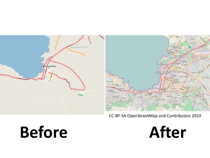
The Humanitarian Open Street Map Team (HOT) is active to this day and community members contribute mapping data to areas in need. This event showed how powerful this community can be and that the data in OpenStreetMap can create a viable map with data that can rival Google and other providers.
OSM is built on open data, meaning you can download and use data from that project and use it with the proper attributions based on their terms of service. New mapping providers now had a viable way to create base maps with a growing global database.
The second event was a major pricing change to the Google Maps API. Google had been the platform of choice for users interested in creating simple mashups to integrating maps into their products. Free or low-cost tools were now very expensive and cost-prohibitive to many organizations.
Google eventually changed their limits, but not before many had left the service, most prominently Foursquare which switched to Mapbox for their services.
Mapping companies born out of the open-source community now had a viable route to compete commercially and provide new tools for those who want to create maps online.
These new tools and data helped to make maps a part of our everyday lives. Maps became an entry point for popular applications such as Yelp and Foursquare. News outlets added more maps to their stories and app developers could create complete experiences centered around a map.

With more location data from OpenStreetMap, developers were able to create their own location data services such as routing for directions or geocoding (getting a geographic location from an address) to compete directly with Google products. The web mapping space for visualizing geographic data took off at such a rate that Google eventually shut down its Google Maps Engine product for visualizing data in 2016.
One major innovation that took place during this period was the vector tile. The technology works in the same way as the map tiles discussed earlier, a request goes to the server and the tiles are returned to the user. However, it isn’t an image tile that is returned, the data itself is stored in the tile, and the browser adds the styles on the data.

This means that not only is the map control much smoother, but the map can change styles based on other data, say user preferences. Google Maps does this to allow ads in their maps and emphasize points of interest you might like based on your Google activity. This means that each user of Google Maps may have a different experience on the map.
As we continued to interact with the world around us, we were also generating massive amounts of data about our movements, preferences, and location. To visualize this data, a new set of technologies emerged, again from open source communities, to put this amount of data on the map.
More data, human mobility, and the future
In recent years, as map data made its way from the map tile into the browser, web mapping was suddenly opened up to a new group of developers. WebGL was released in 2011 and was built to render graphics more efficiently in the browser.
It is used in a wide range of technology, from 3D rendering to video games. As data was made available in the browser at faster speeds, this technology ended up being a good fit for visualizing geospatial data on a map.
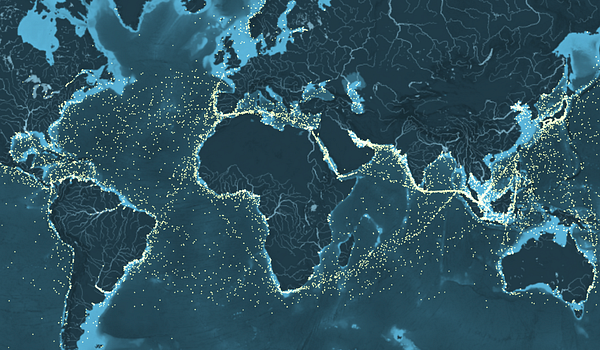
These innovations grew out of need — there was more and more data being generated that needed to be visualized. One company that struggled with this was Uber, which was sitting on data containing millions of ride records which could be used to determine everything from surge pricing to finding more efficient ways to move around cities.
While many other companies had developed tools with a similar technical base, Uber took on the challenge of creating tools that made visualizing massive amounts of data both efficient and visually appealing. Using the advances that had been made for passing vector data into the browser, the Uber Data Visualization team developed Deck.gl.
Since WebGL uses Javascript and is supported by all major browsers, it became a hit with frontend developers. Mapbox had released Mapbox GL a few years earlier which brought the same technology to the base map, but Deck.gl allowed any developer to show a massive amount of data on the map and perform aggregations and 3D visualization.https://forrest.nyc/media/f30fd4cd5da98e437f653828e4653572Deck.gl presentation from Nicolas Belmonte
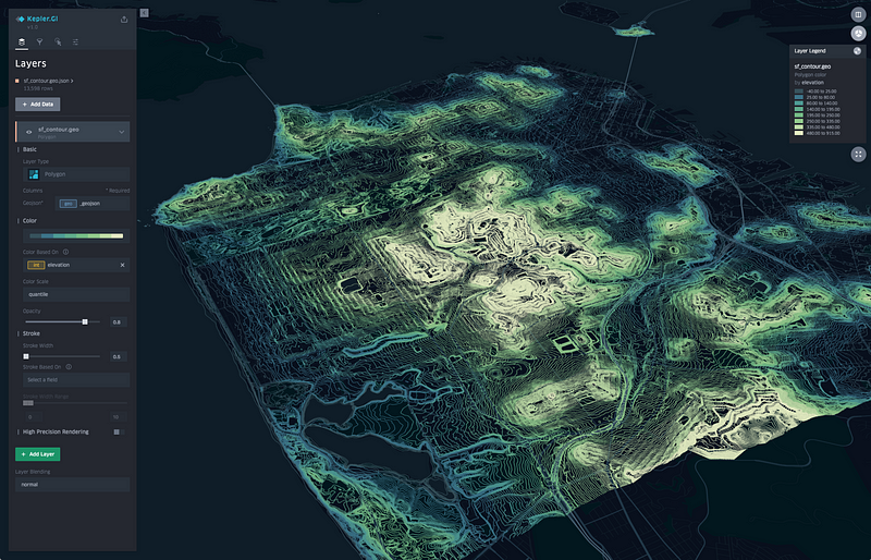
Uber also released Kepler.glshortly after, allowing non-developers to upload data and create their own visualizations through a user interface. We are likely to see more to come with GL visualizations, and these first projects provide an exciting view of what we can start to expect from maps online.
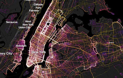
The visualization of massive amounts of data is of course not possible without massive amounts of data. All of us with a mobile device are contributors to this data in one way or another from one of the apps on our phone.
Location data derived from SDKs embedded in mobile apps, mapping or otherwise, has exploded into a major industry that uses your location pings over time to do everything from urban planning to ad targeting, and most recently track the effectiveness of social distancing.
While the data can provide valuable insights for a wide range of analyses such as mobility planning in cities, the industry is effectively unregulated, meaning that how the data is collected and distributed varies widely from company to company. The data is highly valuable for marketers, tracking where you live and shop tells them a lot about your behavior and allows for very targeted advertising.
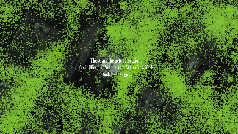
The New York Times published a powerful series around the location data industry called, One Nation, Trackedthat dives into the data, how it does and doesn’t protect your personal information, and how you can track individuals, including the president.
Legislation may be coming to better protect consumers at some point, Foursquares CEO called for the government to regulate the industry, even as their business has pivoted from being a consumer app to a mobility data provider itself.
While the location data industry is not directly related to the web maps we interact with, the blue dot on your phone is a not so subtle reminder that your device knows where you are, and in some way may let consumers know why they are seeing an advertisement for a store they just visited an hour ago.
Web mapping has changed and transformed several times since the original maps first appeared online. The current development around visualizing data in the browser through libraries like Deck.gl will continue to advance, especially as supporting technologies advance as well.
As an open-source project, it is unclear how and if that will be commercialized, but likely many companies will start to play catch up to some of the advancements that have already taken place.
The location tracking space will likely look very different as regulation or other controls will be placed on the industry, most likely first from a state-level as California has explored legislation around this data. However, in the short term, mobility data provides significant insight into how behavior is impacting infection rates and hospitalizations.
Data will only increase in demand, both the quality and wider availability in new geographies. Mapbox, the company that started using OpenStreetMap data to aid non-profits, has already made automotive use cases a major focus including augmented reality navigation using the same OSM data.
As machine learning increases, the demand for massive amounts of spatial data to use in machine learning models will increase as well. Data such as census demographics around the globe and points of interest are still controlled by commercial providers. Some companies such as CARTO, have started to create a central resource for location data from public and private providers.
Roads and physical features have already been made open by collaborators around the world, how different types of data make their way into open environments are yet to be seen. As the need expands, it is likely that this will make its way into some collaborative project.
Web mapping has changed greatly over the years, and yet the pace of development doesn’t seem to slow down. It is driven by our desire and need for answers and information about our world. Ultimately what happens next, as it has been since the first maps were created by humans, will be driven by what we want to know about our world, and is left up to all of us to decide.